
Salesforce Lightning UI Best Practice with SLDS
Introduction
In Salesforce we can customize the UI with the help of salesforce declarative approach and Aura / LWC (Lightning Web Components) components. Also, on top of that we are using SLDS for rich UI.
Why SLDS?
In custom UI development, SLDS provides Ready-to-use HTML and CSS (Cascading Style Sheets) UI elements for Salesforce experience.
Design Principles
During the front-end development, we need to focus following areas
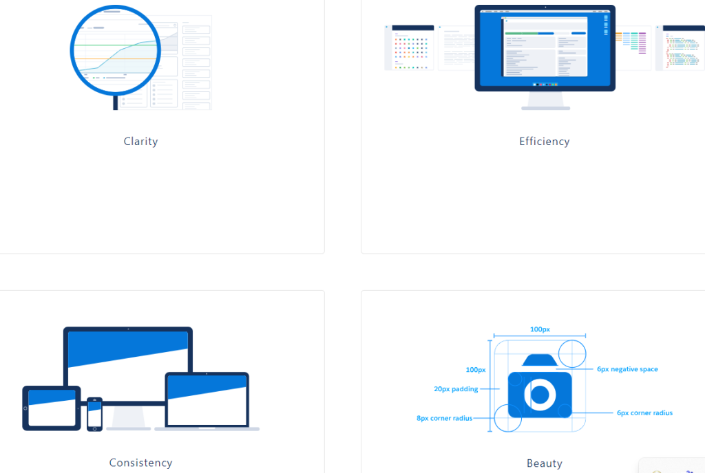
- Clarity – Enable people to see, understand, and act with confidence.
- Efficiency – Intelligently anticipate needs to help people work better, smarter, and faster.
- Consistency – Create familiarity and strengthen intuition by applying the same solution to the same problem.
- Beauty – Demonstrate respect for people’s time and attention through thoughtful and elegant craftsmanship. Demonstrate respect for people’s time and attention through thoughtful and elegant craftsmanship.
Customize – Do not Change the Core
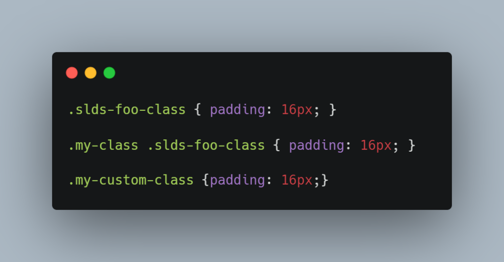
If you are writing custom CSS that cancels out the styling of the Lightning Design System, you are overriding instead of customizing.
Example :
LWC
Aura
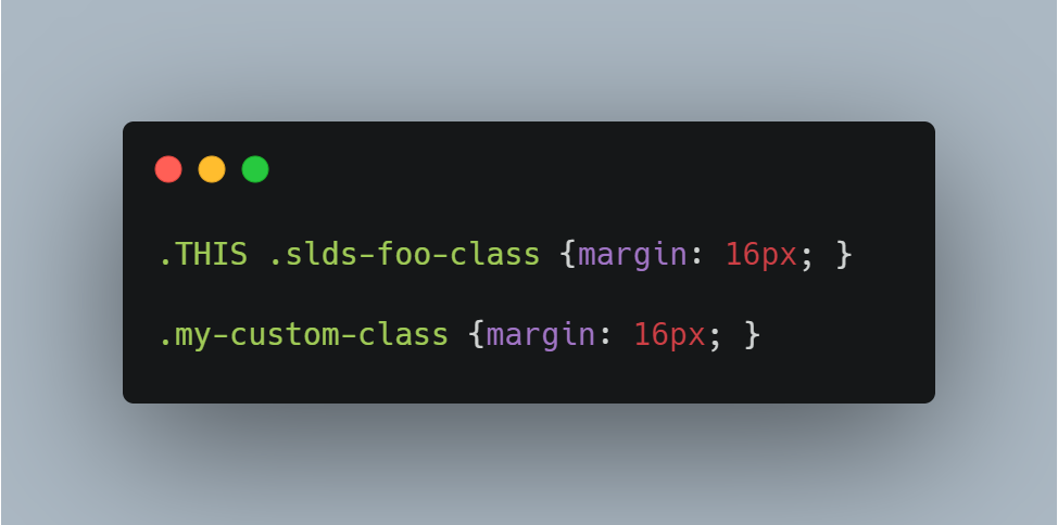
In the above example we have taken both LWC and Aura component CSS examples.
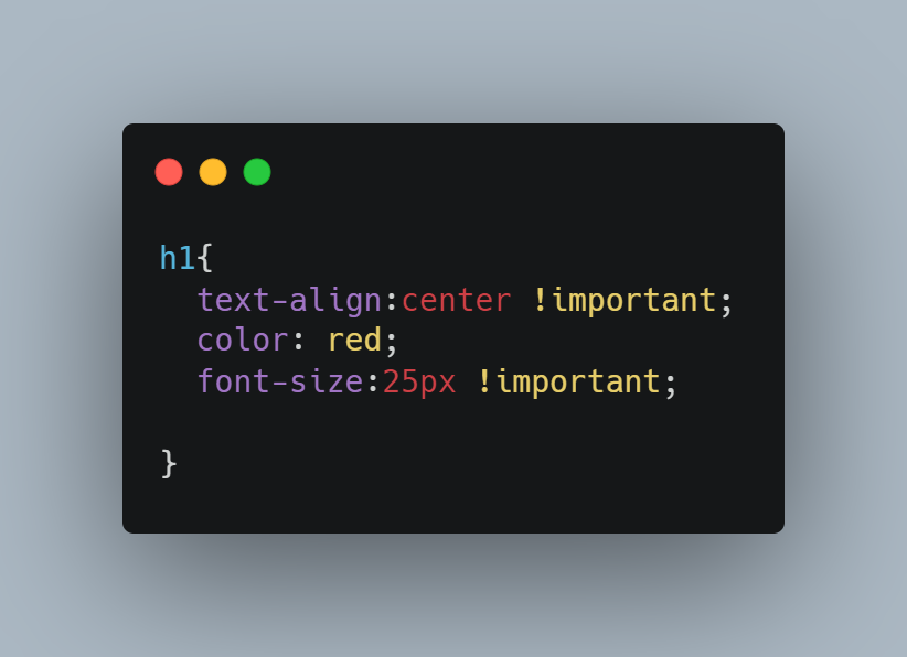
- In LWC example we are trying to apply the padding. Here the first two lines overriding the standard slds core padding properties.
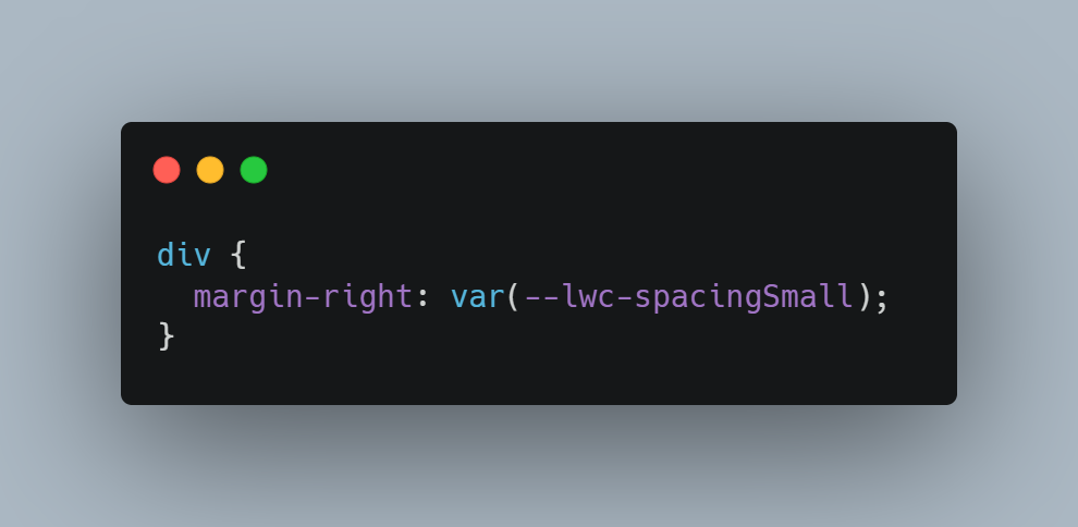
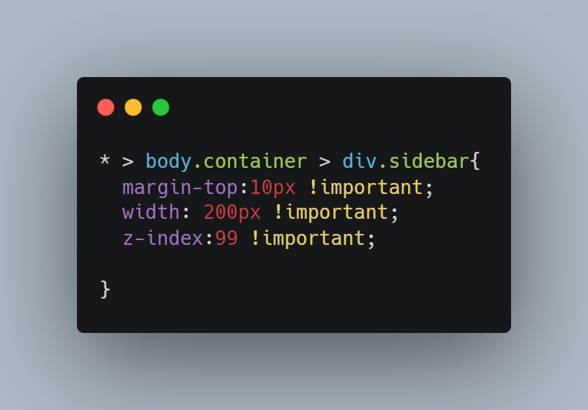
- In Aura example, we are trying to apply the margin. The first line overriding the slds core margin. The second line is the best way.
Design Tokens
Design tokens are named entities that store visual design attributes, such as margins and spacing values, font sizes and families, or hex values for colors.
Lightning web components can use any Lightning Design System design token marked Global Access.
To reference a design token in your Lightning web component’s CSS, use the –lwc- prefix and reference the token name in camelCase.
Example
Why is Design Token important?
Take an example: we are going to build a new community portal in the experience cloud. It is fully based on Figma. All the web pages will have the following sections.
- Header
- Sidebar
- Content
- Footer
In this all section some of the properties will be common for all the pages for example
Font color, Font Size, Font Family, Margin or Padding, this kind of properties can be maintained in design tokens so CSS file will be in clean structure.
CSS Styling
First up is practicing good CSS hygiene. A few rules of thumb (learn more at MDN!):
- Do not use type selectors with classes, for example,
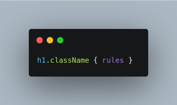
They raise your CSS specificity and create a dependency on your markup that is likely to cause issues in the future.
- Avoid long, nested selectors. This is a major red flag that your CSS has specificity issues, and they are only going to get worse unless you address them.
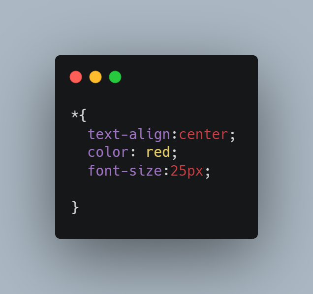
- Avoid the universal selector, for example, * { rules }. Its range is too broad, which makes it too unpredictable; you are setting yourself up for styling conflicts.
- Do not use !important declaration as a hammer. Rare exceptions notwithstanding, this is another red flag; if you are using the !important declaration as a last resort, you need to diagnose why.
In other words, do not write CSS like this! This is like the final boss of bad CSS.
Focus Areas
There are some key points you can follow to ensure consistent and effective implementation.
- Follow SLDS documentation: The Salesforce Lightning Design System developer guide is your main resource. It provides detailed guidelines, factors with exemplifications.
Refer: https://www.lightningdesignsystem.com/
- Design for responsiveness: SLDS comes with responsive components that will work on different screen sizes. Develop your components and layouts to be responsive, ensuring a consistent experience across all devices.
- SLDS CSS classes and utility classes: SLDS provides a set of CSS classes and utility classes that you can use to style your components. Stick to these classes as much as possible to maintain consistency and reduce custom CSS.
- Use SLDS components: SLDS provides a collection of pre-built components such as
- buttons,
- forms,
- modals,
- List view
- Table and more.
Utilize these components instead of building custom ones. They are well-tested, accessible, and ensure a consistent user experience.
- Web Accessibility: Check your SLDS implementation with the following accessibility guidelines.
- Use semantic markup,
- provide alternative text for images,
test your components with accessibility tools to ensure they are usable by everyone.
Refer: https://www.w3.org/
- Web Performance optimization: Optimize your SLDS implementation.
- Minimize the number of HTTP requests
- Use SLDS CDN for CSS and JavaScript
- Optimize any custom code you write.
- Keep up with SLDS updates: Salesforce regularly finetune SLDS with new components, features, and guidelines. Stay connected to these updates and implement them into your design. It will help you take advantage of the latest improvements and ensure compatibility with future releases.
- Test across all major browsers and devices: SLDS was created to work across various browsers and devices. Test your implementation thoroughly on different browsers, operating systems, and devices to make sure everything works fine.
- Document your customizations: If you need to customize an SLDS component or create a new one, document your changes in the module itself, which will make it easier for other developers to understand and maintain your code.
Just follow these best practices, you can create effective, maintainable, and user-friendly Web Application using SLDS.